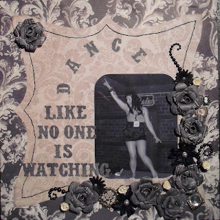
The layout for inside Naomi's wall box was slow in creation. It started off in my mind as a little, simple layout with the wording "Home Is Where The Heart Is" (or something similar). I knew that a photograph had to be found for the layout, and so I started looking... and looking... and still more looking...
I could find not a single photograph that would match the idea and theme of the layout. There were, however, hundreds of photographs of my bautiful daughter being crazy and funny... dancing like she was the only person in a room seemed a recurrent theme... and so a new idea for the layout came to fruition.
There were so many photographs of Naomi that I knew would fit into the design... so I decided to make the layout in a way that Naomi could change around the photographs when she wanted to.
I usually create a layout around the photograph... whilst the photo is stuck to the paper. This time I had to make a layout bearing in mind that the photograph had to slp easily in and out of a pocket (I fronted this pocket with acetate).
A MEGA stash-dive ensued to find bits and pieces that would match the design... and I made the paper flowers and roses myself.
The papers (I sewed one piece onto another) are from "g.c.d studios", a Tina Higgins design called "Paris Nights" - really gorgeous paper collection - though a lot of the papers have a 'felt' design in them, and this makes it almost impossible to cut with a punch :) (including Martha Stewart punches). The photograph is from the "Tesco Totties" holiday to Benidorm last year - my Naomi up on stage having a whale of a time!... Dancing like no-one is watching :) The title lettering is die-cut on my little sizzix sidekick - Tim Holtz "Vintage Market" (a VERY well-used piece of equipment).
Behind the layout is a slit in the backing paper so that the photograph can be changed, and also a pocket to hold all the other photographs that she can interchange. Naomi loved this idea, and the box has been made so that it is easily opened and shut again to change the pictures. The layout is held inside the presentation/wall hanging box with little velcro circles.
I so enjoyed making this - and it only took a couple of days (including waiting for the paint to dry). Naomi now has it up on her wall... and even if I do say so myself, it looks pretty good :)


3 comments:
I love this idea! Very clever - a changeable layout? I like it!
It is gorgeous and a great idea with the interchangeable photo's. Love it :)
The papers are perfect for that gorgeous project, hope she lvoed it :) Also spied your beer mat minibook, what a clever idea! Will have to give that a go! xxx
Post a Comment